STATUS TRACKER
Empower Viome Customers to effortlessly monitor the status of their health test results
OVERVIEW
Company Information
Viome is a health-tech company that focuses on personalized health and wellness.
Viome Products Include
At-home microbiome health tests: customers send in their blood, stool, and saliva samples to receive health insights and personalized food recommendations
Custom-formulated supplements & biotics based on health test results
The delay in receiving their health test results is causing frustration among customers, as it exceeds their expected turnaround time.
CUSTOMER PROBLEM
BUSINESS PROBLEM
6%
canceled tests*
*Quarterly average from 2020 to 2022
~$1.5M
loss in revenue (refund) per year
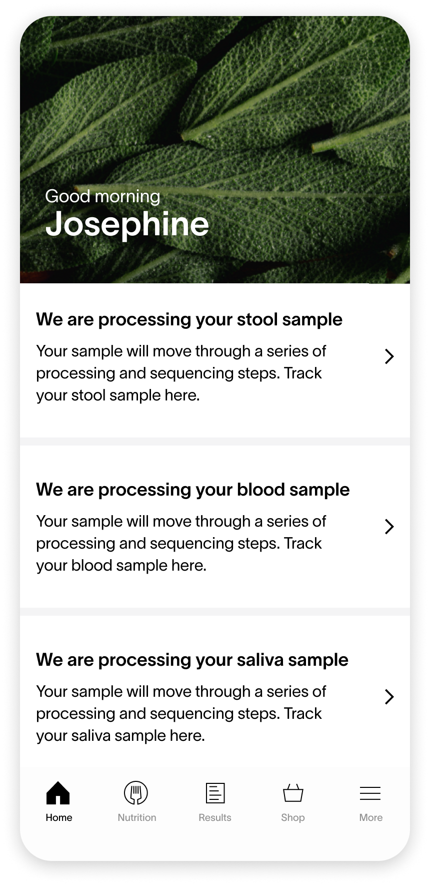
After sending in samples, customers see a status notification for each sample.
CURRENT UX AUDIT
UX Issue #1 : Information Overload
Repetitive information
Wordy UX writing for each notification
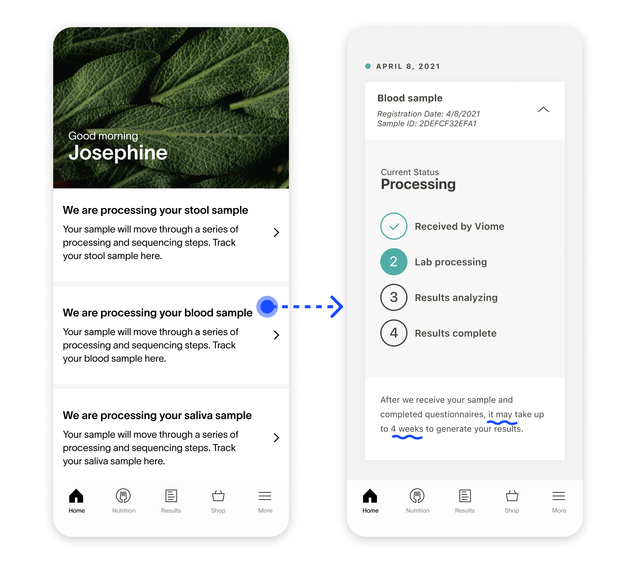
Customers need to tap the notification to see the status of each sample.
CURRENT UX AUDIT
UX Issue #2: Buried Information
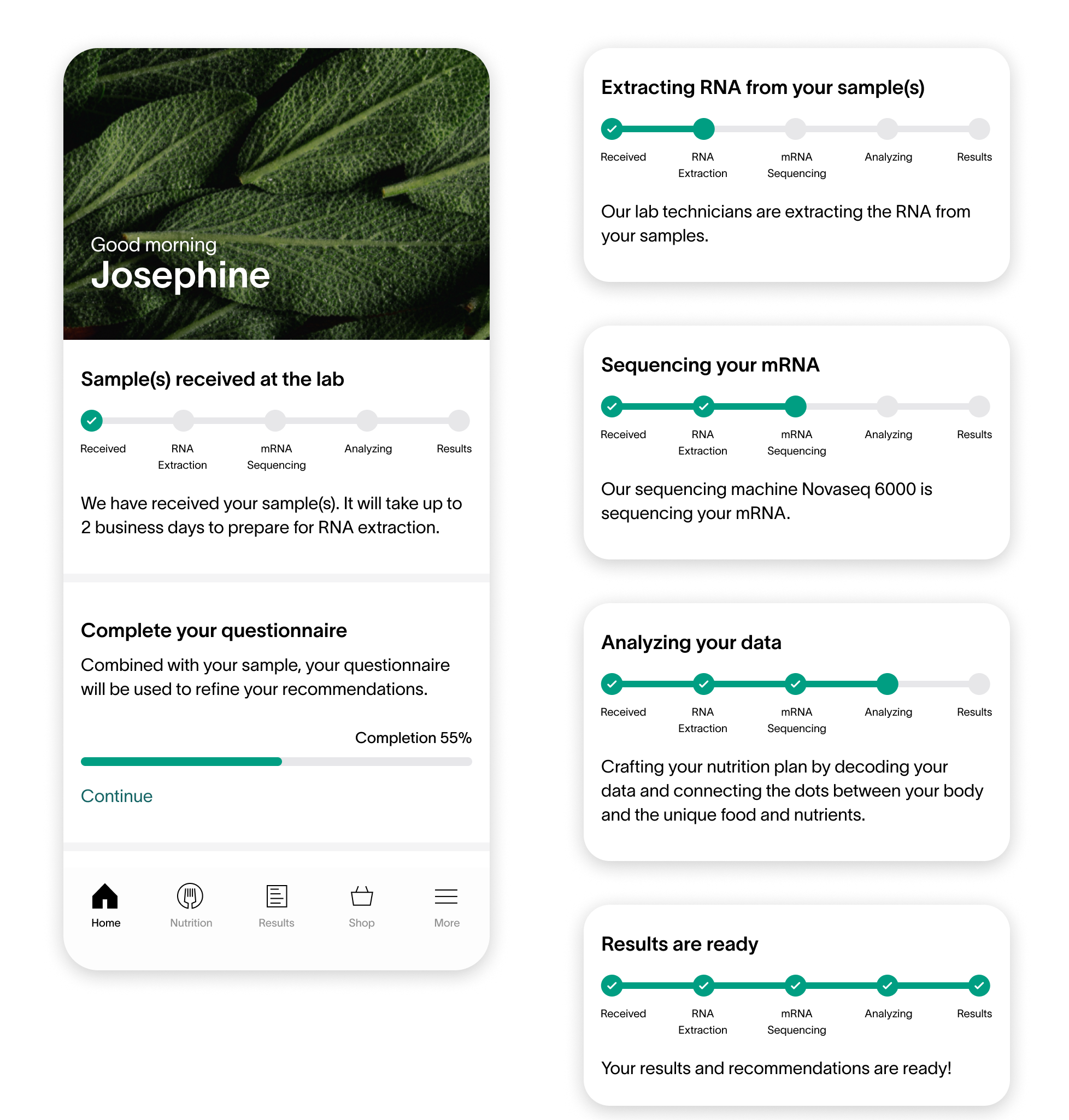
Customers won’t see this 4-step process until they click on the sample notification to get to this page.
UX Issue #3: Unclear Results Time
It is unclear that when customers will receive their results.
After waiting for 3 weeks, customers open the Viome app and see their result status is still at lab processing.
Nothing changed. Customers get frustrated.
RESEARCH FINDINGS
Processing takes the longest time among all the steps. Why is that?
5 Substeps within Processing
I discovered that there are 5 substeps within the processing status. However customers don’t know this information at all.
Complex process
Processing is very complex because it involves RNA extraction and sequencing. Each substep depends on the success of the previous one.
–––––– Learnings from the Viome lab visit
“Could we show customers the real-time status of each substep during processing to increase transparency?”
THE CONSTRAINTS
Showing substep is not feasible
The answer I received after inquiring the lab director was “no”. The status of each substep is updated manually internally, so it’s not accessible to external customers.
Information is too technical
The name of each substep is very difficult to understand for external customers, which might cause more confusion.
INITIAL DESIGN (Showing substep status is not feasible)
Simplified Status
Combining the status of all samples reduces information overload. Customers only need to see one card component regarding the status of their health test results.
More Context
Providing more detailed explanations of lab processing helps manage customers’ expectations and increases transparency.
Cons
This is not the ideal solution because it’s still not clear how far along the “processing” stage is.
DESIGN EXPLORATIONS
What if we could remove the constraint?
It’s important for customers to see the real-time status of the substeps, which can greatly increase transparency and build trust. By proposing the ideal solutions, I would like to get buy-in from more stakeholders.
I explore 3 additional design options.
Design Option 1
Pros
Providing real-time status and explanations of lab processing set expectations and increases transparency.
Cons
The real-time status is hidden in the details and it won’t appear until customers tap on the “See status in details” link.
Design Option 2
Pros
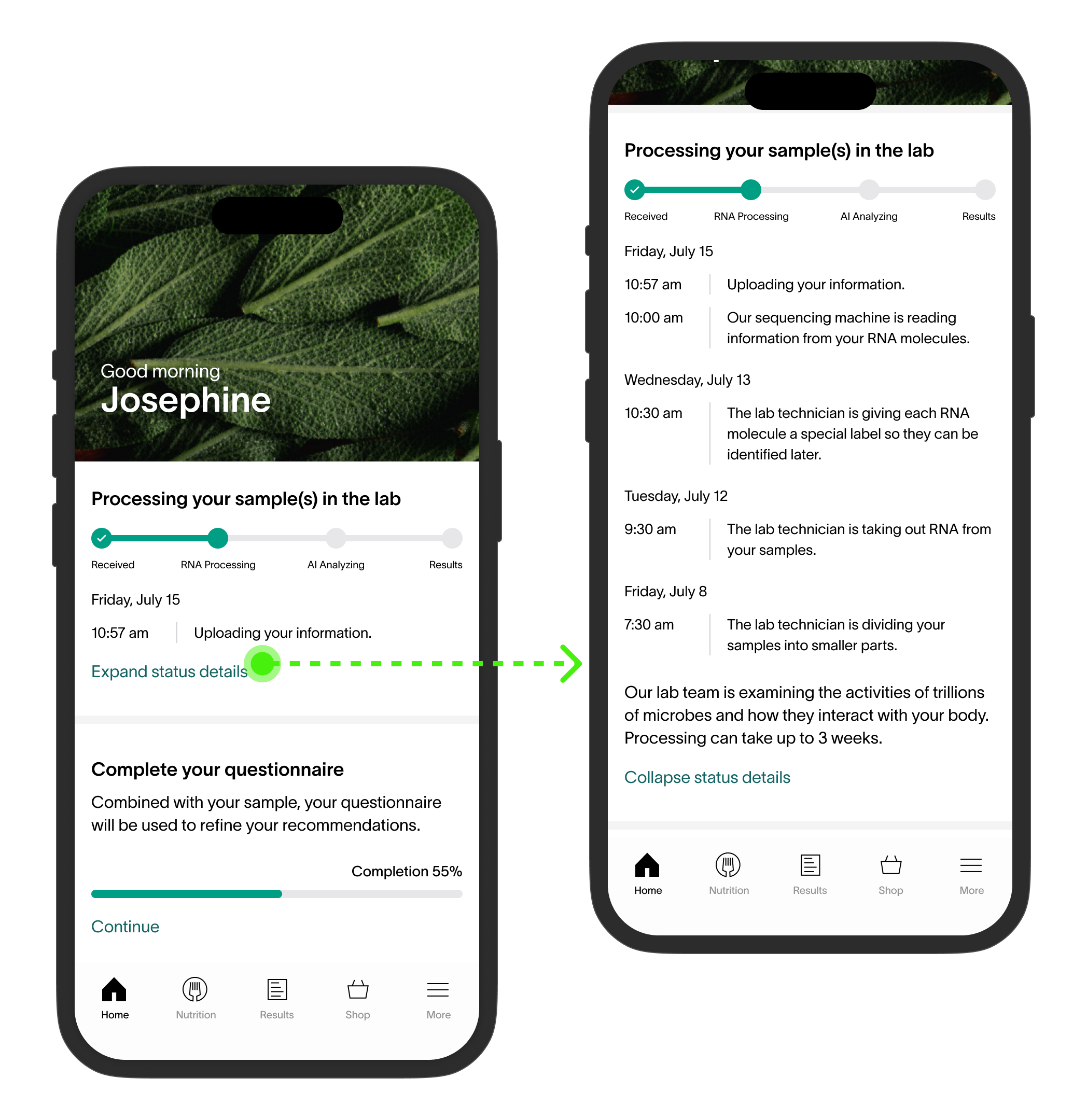
Show the most recent update upfront.
“Expand status details” gives in-depth info without cluttering the main view.
Cons
Doesn’t tell customers the total time it will take for lab processing.
Design Option 3
Pros
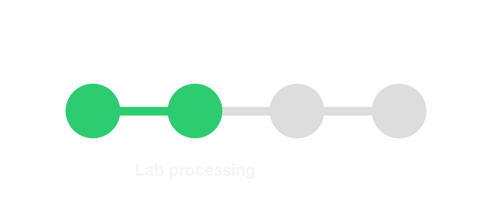
Breaking down the lab processing into two key steps creates the perception of accelerated progress for the samples.
Cons
We're unable to provide a specific timeframe for RNA extraction and mRNA sequencing separately. Customers may not be familiar with these terms.
USER TESTING FINDINGS
01
Jargons
7 out of 10 participants thought the terms are too hard to understand.
02
Timely-updates
7 out of 10 participants pointed out the timely updates are very helpful.
I conducted user testing with 10 participants on UserTesting.com
03
High-level info
6 out of 10 participants prefer seeing high level information upfront over technical details.
The Ideal Design Solution
––– after design iterations & user testing
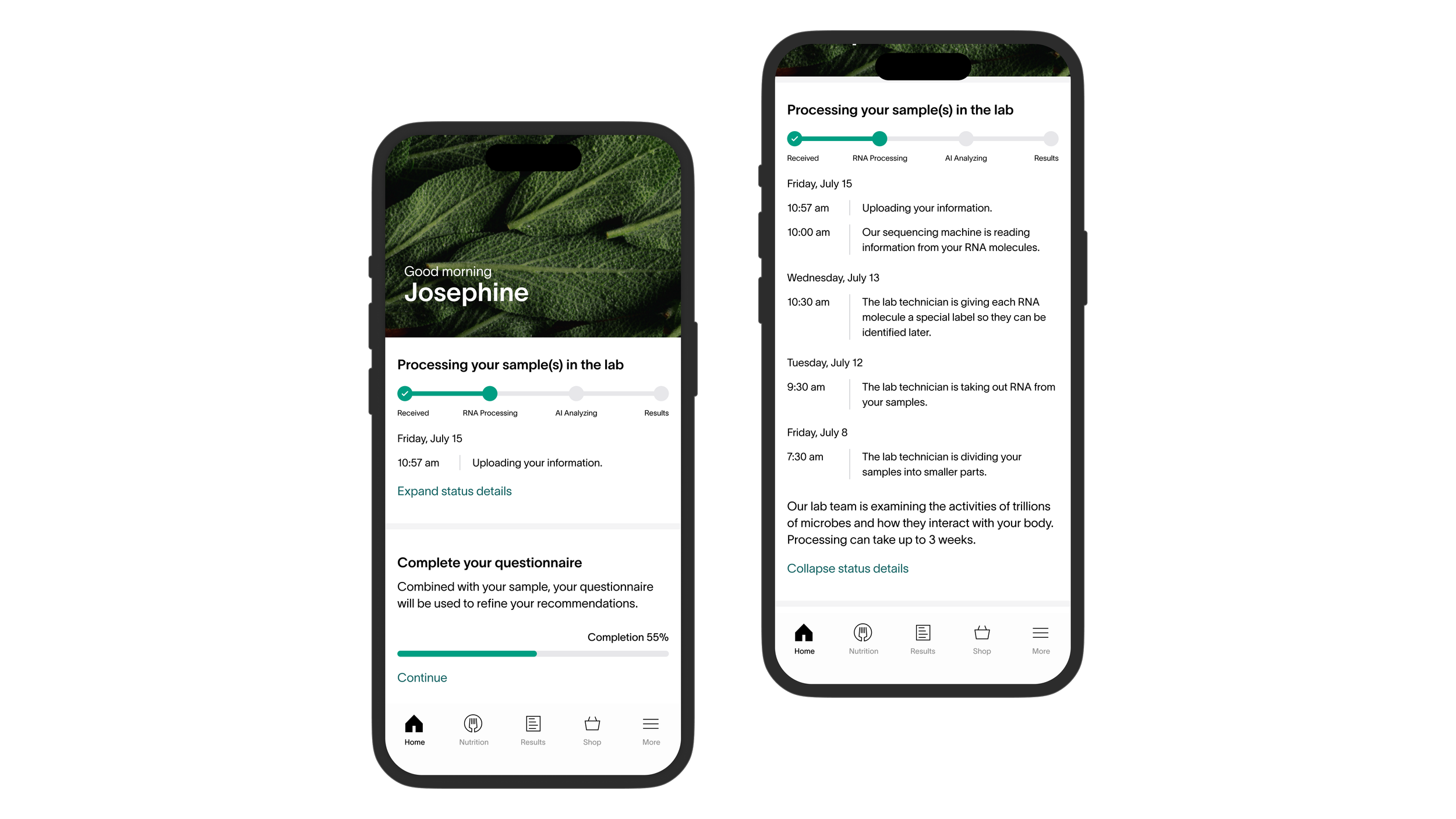
Real-time status within processing
Since processing takes the longest time, giving any updates within this process helps manage expectation.
Simple UX writing
Instead of using jargons, provide information customers can understand. E.x., “RNA extraction” is phrased as “The lab technician is taking out RNA from your samples”.
EDGE CASES
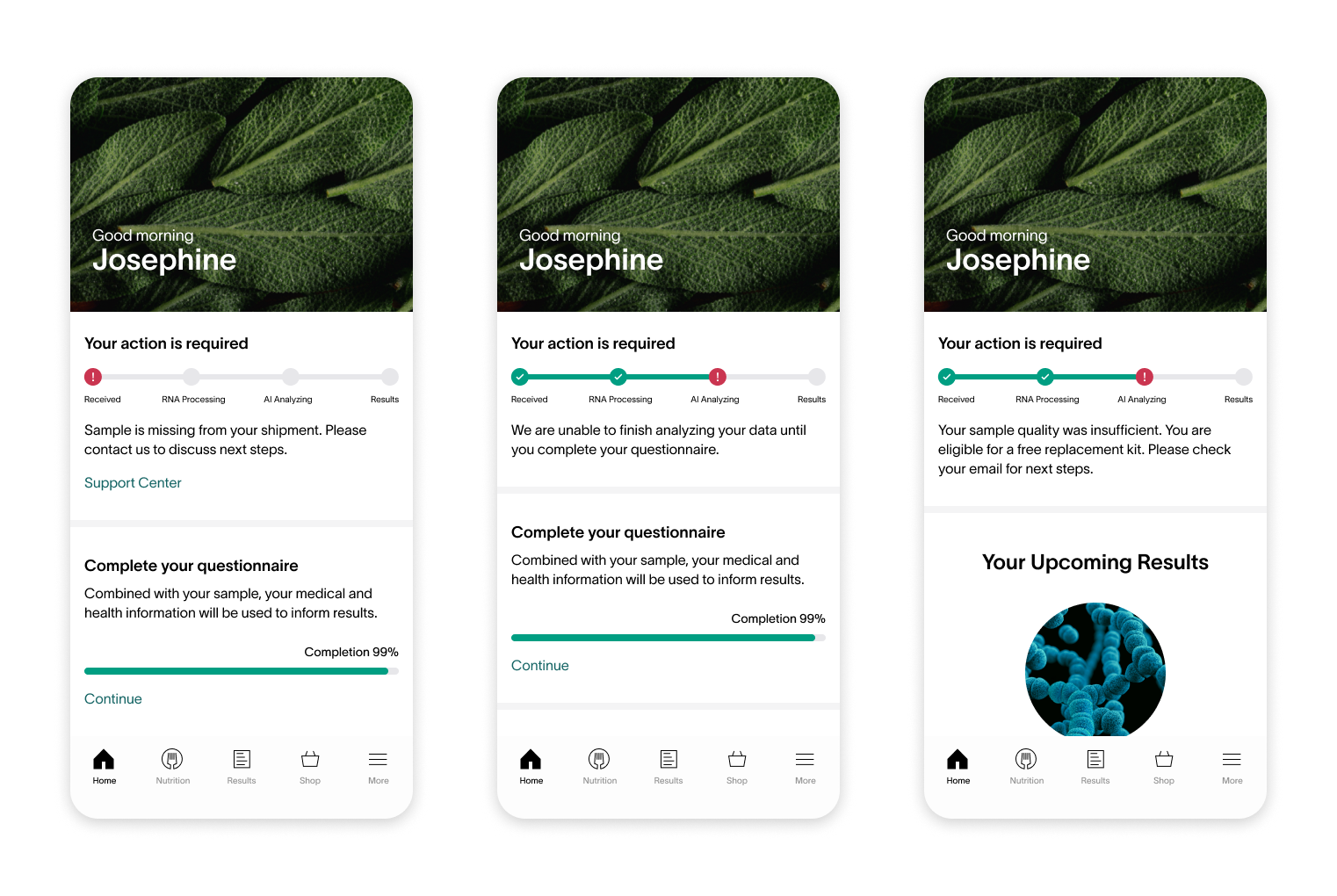
Errors can occur at any stage of the process, affecting turnaround time. Showing the status card on the homepage provides customers with a quick overview of any issues related to their samples, enabling them to promptly take corrective action.
Proposed ideal design solution ✅
Got the Director of Product buy-in ✅
“How could we make this happen?”
HOW I DEALT WITH CONSTRAINTS
By asking the last question, I discovered that I needed to involve lab system engineers to collaborate with the software development team to link the lab internal database to our app’s database. This would remove the constraint.
Therefore, showing real-time updates of processing became feasible.
BUSINESS IMPACT
6%
canceled tests
2.8%
canceled tests
In 2023, canceled tests reduced to 2.8% on average quarterly.
~$1.5M
avg. refund per year
700K
refund in 2023
This means, there was a $800K increase in revenue due to less canceled tests.
.png?format=1500w)
